
It’s one of the things we hear most: “Everyone says my website looks great, but hardly anyone reaches out.” The problem is almost never the visuals. It’s that the site was built to look good, not to get visitors to do something. That’s the job of website UX design.
Below you’ll find the 5 things that look good but rarely sell. Tick the ones your homepage has, then run the 10-minute test at the end.
- 01A slider that rotates on its own
- 02Animations that delay content
- 03Generic phrases
- 04Stock photos unrelated to you
- 05Sections that repeat themselves
What is website UX design, and how is it different from aesthetics?
Aesthetics is how your website looks: colors, photos, typography, animations. UX (user experience) is how easy it is for visitors to find what they need and do what you want them to do. Aesthetics catch the eye; UX decides whether the visitor calls, books a showing or requests a quote.
Both matter. A sloppy site creates distrust, and an easy-to-use but unattractive one can look unprofessional. The problem starts when looks become the goal and UX takes a back seat.
Why can a beautiful website fail to sell?
Because beautiful isn’t always useful. Many sites spend the first screen on a slider with stunning photos and a generic tagline, while visitors can’t find what the business offers, what it costs or how to get in touch. They admire the design for a few seconds and leave.
The usual symptoms: compliments on the design but few messages, lots of visits that leave without interacting, and clients who call to ask things the website should already answer.
Does your first screen rotate through slides on its own?
Auto-rotating sliders look dynamic, but visitors rarely wait for the second slide. Meanwhile, the most valuable space on your site shows a photo instead of what you do, for whom and what to do next.
Open your homepage on your phone. If the first screen changes on its own, tick this item.
Do animations make visitors wait to read?
Text that fades in, sections that slide up, counters that spin: they feel premium, but every effect that delays content is a few more seconds before the visitor understands your offer, and on phones they often slow the whole page down.
Scroll your homepage quickly on your phone. If you have to wait for text to appear, tick this item.
Does your headline say something any competitor could say?
“Your dream home awaits” or “Comprehensive quality solutions” sound nice and say nothing. If you could swap your logo for a competitor’s and the sentence still works, it isn’t telling visitors why they should choose you.
Cover your logo and read your headline. If it could belong to any business in your industry, tick this item.
Are your photos stock images that could be anyone’s?
A smiling team in a generic office or a handshake on a white background fills space, but visitors recognize stock photos instantly. Real photos of you, your team and your work build more trust, even if they’re less polished.
Look at the photos on your homepage. If most of them aren’t of you, your team or your work, tick this item.
Do several sections say the same thing?
“About us”, “Why choose us” and “Our mission” often repeat the same message three times. Every repeated section pushes your prices, reviews and contact form further down, where fewer people see them.
List your homepage sections from top to bottom. If two or more say essentially the same thing, tick this item.
How do you know which sections of your website to cut?
With a test that takes about 10 minutes. Open your website on your phone, list every section from top to bottom and ask these three questions about each one:
- If I removed it, would I lose sales?
- Does it answer a question my clients ask?
- Does it bring visitors closer to the main button?
A section that gets a “no” to all three is decoration. If you ticked items along the way, this is your result:
Your site gets to the point. Next step: measure what visitors do.
Remove or combine those sections and move what sells higher up.
Your homepage needs a new structure before more design.
What actually makes a website sell?
The elements that save visitors effort: a headline that says what you do and for whom, visible prices or price ranges, real trust signals, a short form and an easy-to-find contact button. They’re less eye-catching than a slider, but they turn a visit into a conversation.
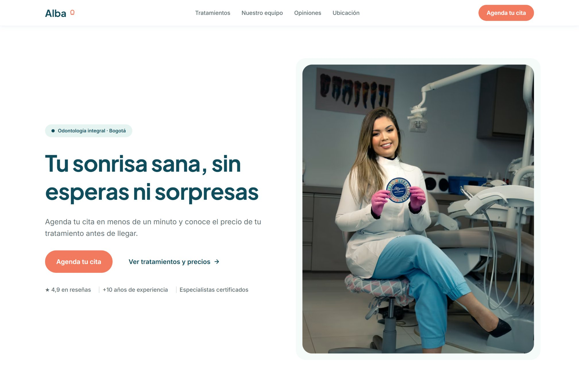
In our concept case for a dental clinic, every treatment shows its duration and starting price. It isn’t the flashiest section, but it answers the first question almost every patient has.
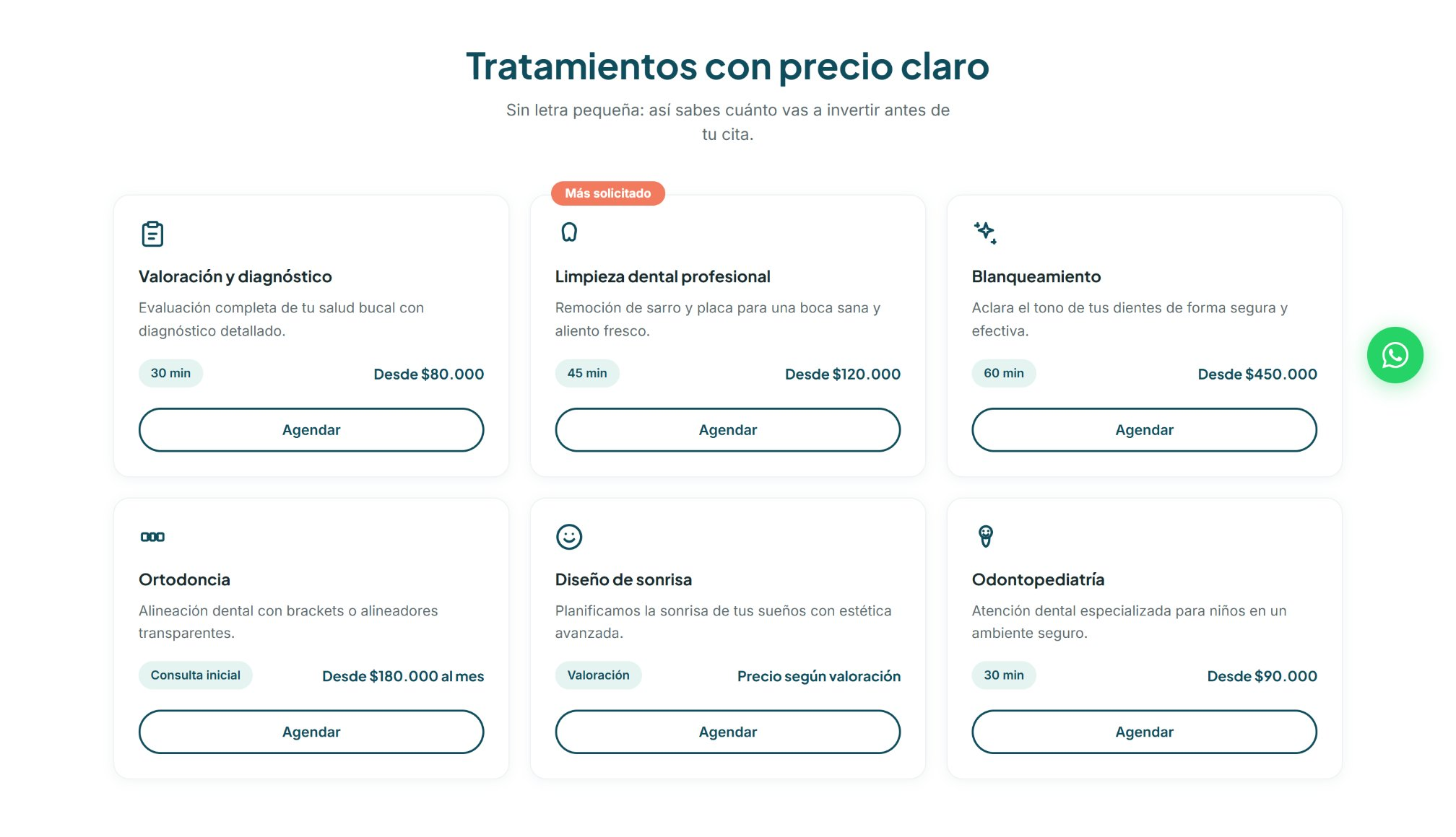
Do you have to redesign your whole website to improve UX?
Almost never. Often a website doesn’t need more design, but less. Removing a slider, moving the form up or replacing a generic phrase with a clear headline can have more impact than a full redesign.
What matters is measuring before and after each change: set up conversion events, like submitted forms or call clicks, and compare. For the full list of what a website needs to convert, read the 7 elements of a website that converts.
See how your website performs today
The free website audit shows your site’s speed, SEO and accessibility with Google data. If you’d rather we review your homepage with you, message us.
Frequently asked questions
It’s designing a website around the user experience: how easy it is for visitors to find what they need and take the action the site invites them to take, like calling, booking or requesting a quote.
It helps build trust, but it isn’t enough. What makes people act is structure: a clear message, useful information and easy contact.
Not always, but they often take up the first screen without answering any of the visitor’s questions. If you use one, make sure every slide has a clear message and a button.
By measuring conversions before and after: submitted forms, call clicks or messages. Without that tracking, it’s hard to know whether the change worked.