
It's one of the things we hear most often: "Everyone tells me my website looks great, but hardly anyone contacts me." The problem is almost never the visual design. It's that the website was built to look good, not to get visitors to do something. In this article, we explain the difference between aesthetics and user experience, why a beautiful website may not sell, and a simple test to find out which parts of your website are just taking up space.
What is the difference between UX and aesthetics on a website?
Aesthetics is how your website looks: colors, photos, typography, animations. User experience, or UX, is how easy it is for visitors to find what they're looking for and do what you want them to do. Aesthetics catch the eye; UX decides whether the visitor reaches out, requests a quote, or buys.
Both matter. A sloppy website creates distrust, and an easy-to-use but unattractive website can look unprofessional. The problem starts when aesthetics become the goal and UX takes a back seat.
Why can a beautiful website fail to sell?
Because beautiful isn't always useful. Many websites devote the first screen to a slider with stunning photos and a generic tagline, while visitors can't find what the business sells, how much it costs, or how to get in touch. They spend a few seconds admiring the design and then leave without doing anything.
The most common symptoms are compliments on the design but few messages, lots of visits that leave without interacting, and customers who message to ask things the website should already answer.
Which website elements are usually just decoration?
The most common are sliders that rotate on their own, animations that delay the content, generic phrases like "Comprehensive quality solutions," stock photos unrelated to the business, and sections that repeat what has already been said. They look good, but they don't answer any of the customer's questions.
That doesn't mean they're forbidden. An animation can guide the eye toward the main button, and a good photo can build trust. The difference is whether each element has a clear purpose.
Which elements actually make a website sell?
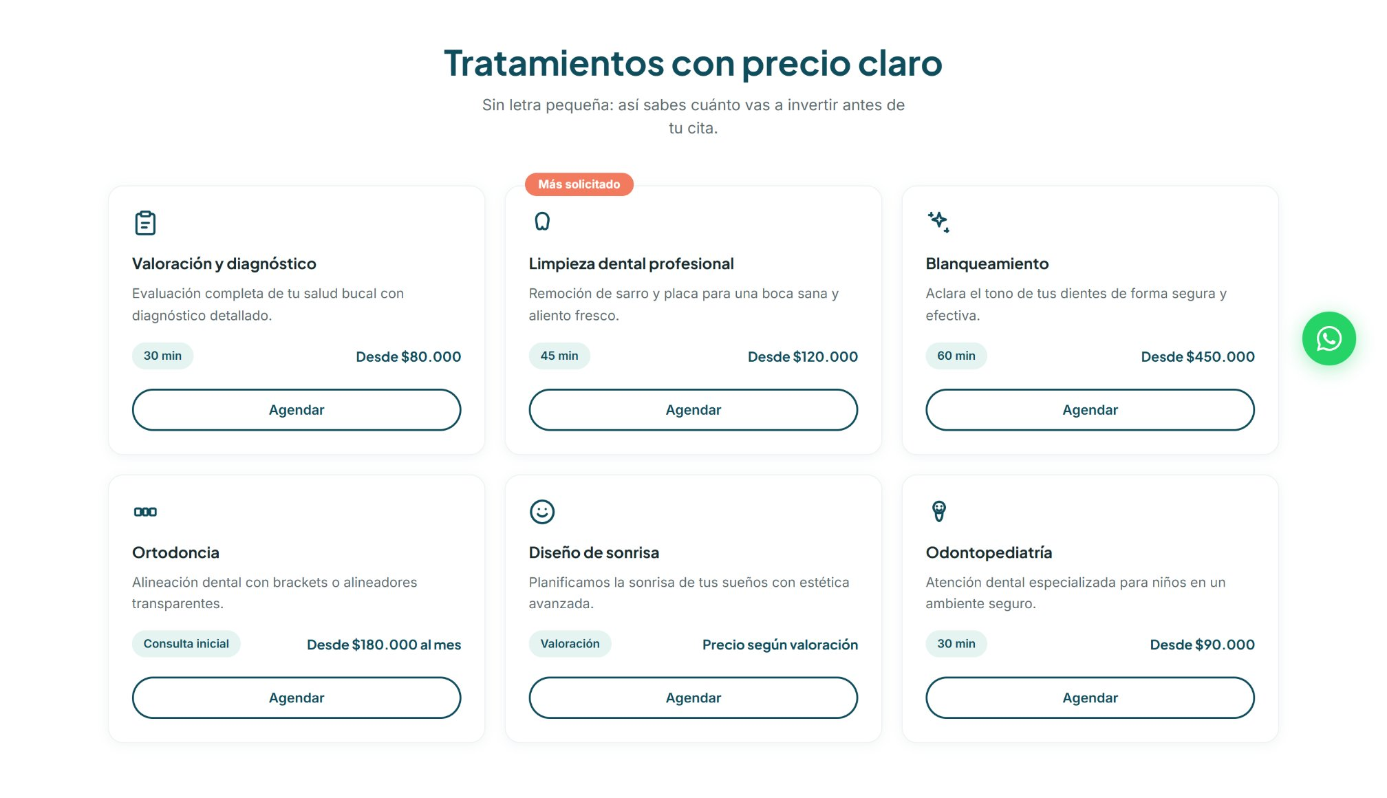
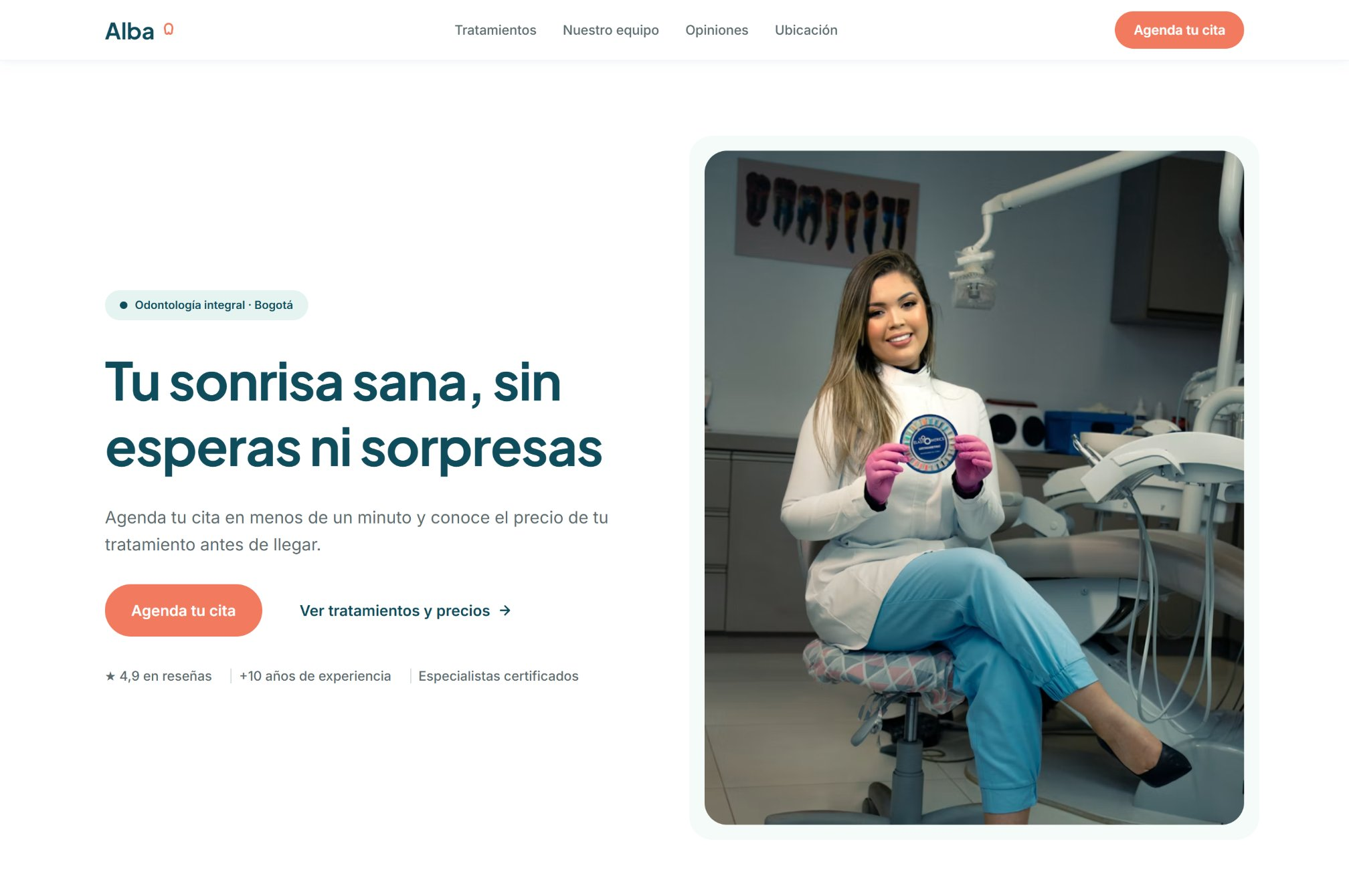
The ones that save visitors effort: a headline that says what you do and for whom, visible prices or price ranges, real trust signals, a short form, and an easy-to-find WhatsApp button. They're less eye-catching than a slider, but they're the ones that turn a visit into a conversation.
In our concept case for a dental clinic, for example, every treatment shows its duration and starting price. It isn't the flashiest section of the website, but it answers the first question almost every patient has.
How do you know which sections of your website to cut?
With a simple test that takes about 10 minutes: for each section of your homepage, ask yourself, "If I removed it, would I lose sales?" If the answer is no, and that section also doesn't answer any customer question or bring them closer to the main button, it's decoration.
Step 1: open your website on your phone and list every section, from top to bottom.
Step 2: for each section, answer three questions: would I lose sales if I removed it? Does it answer a customer question? Does it bring them closer to the main button?
Step 3: mark as decoration any section that gets a "no" to all three.
Step 4: check whether your website is missing any of the elements that actually sell.
Step 5: remove what's extra, move what matters higher up, and combine sections that say the same thing.
Do you have to redesign your whole website to improve UX?
Almost never. Often, a website doesn't need more design, but less. Removing a slider, moving the form up, or replacing a generic phrase with a clear headline can have more impact than a full redesign. What matters is measuring before and after each change, so you know what worked.
The best way to do that is to have conversion events set up, like submitted forms or WhatsApp clicks, and compare how many you get before and after the change. If you'd like the full list of what a website needs to convert, check out our guide to the 7 elements.
Conclusion
A beautiful website isn't a mistake, but it isn't a strategy either. Aesthetics open the door; user experience is what makes visitors step in and take action. Before thinking about a redesign, put every section of your website through the test: if you removed it, would you lose sales? Whatever doesn't pass is probably taking the place of something that does sell.
If you'd like us to review your website with you, message us on WhatsApp.
Frequently asked questions
What is UX on a website?
It's the user experience: how easy it is for visitors to find what they're looking for and do what the website invites them to do, like reaching out, requesting a quote, or buying.
Doesn't a beautiful website help sell?
It helps build trust, but it isn't enough. What makes people take action is structure: a clear message, useful information, and easy contact.
Are sliders bad for a website?
Not always, but they often take up the first screen without answering any of the visitor's questions. If you use one, make sure every slide has a clear message and button.
How do I know if my website improved after a change?
By measuring conversions before and after: submitted forms, WhatsApp clicks, or calls. Without that tracking, it's hard to know whether the change worked.