
At many dental practices, booking an appointment still depends on someone answering messages between patients. Meanwhile, the same questions pile up: how much is a cleaning, is there a slot on Saturday, where are you located. To show how good dental website design can do that work, we designed Alba Dental Clinic.
Alba Dental Clinic is a fictional brand, created to show our design process: it isn’t a real client and it doesn’t present real results. As you read each decision, tick the ones your practice’s website already has.
- 01A headline that answers fears
- 02Visible prices
- 033-step booking
- 04Sticky button on mobile
- 05Team and trust signals
- 06Appointment tracking
What problem does the Alba Dental Clinic website solve?
It stops booking from depending on whoever is free. The site answers the usual questions, like prices, hours and location, and lets patients request an appointment in under a minute. So the team stops booking by hand and only confirms, while it keeps treating the patients already in the chair.
Every section answers a question a patient would otherwise send as a message. If the site answers it first, the patient arrives at the conversation with the decision almost made.
Why does the headline promise “no waiting, no surprises”?
Because it names the two most common fears of anyone looking for a dentist: waiting too long for an appointment and getting a shock at the price. A headline that answers those fears says in one line what the patient gets, which is exactly what a value proposition should do.
Below it, one sentence explains how the promise is kept: book in under a minute and know the price before you arrive. Right after, a single main button, “Book your appointment”, with a row of trust signals: reviews, years of experience and certified specialists.
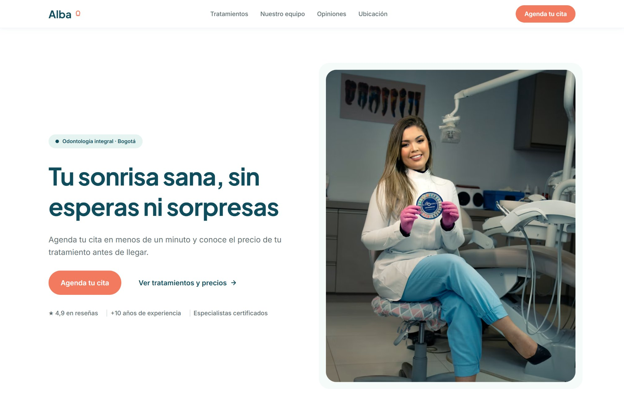
Read your site’s headline. If it doesn’t say what the patient gets, or there isn’t a single main button below it, don’t tick this.
Why show prices on a dental practice website?
Because price is almost every patient’s first question and, when they can’t find it, they either message to ask or go look at another practice. A “from” price and the length of each treatment answer that question up front.
When a treatment has no fixed price, like a smile makeover, the card says so clearly: “Price after assessment”. That’s more honest than a made-up number. And a “Most requested” label helps patients who don’t know where to start.
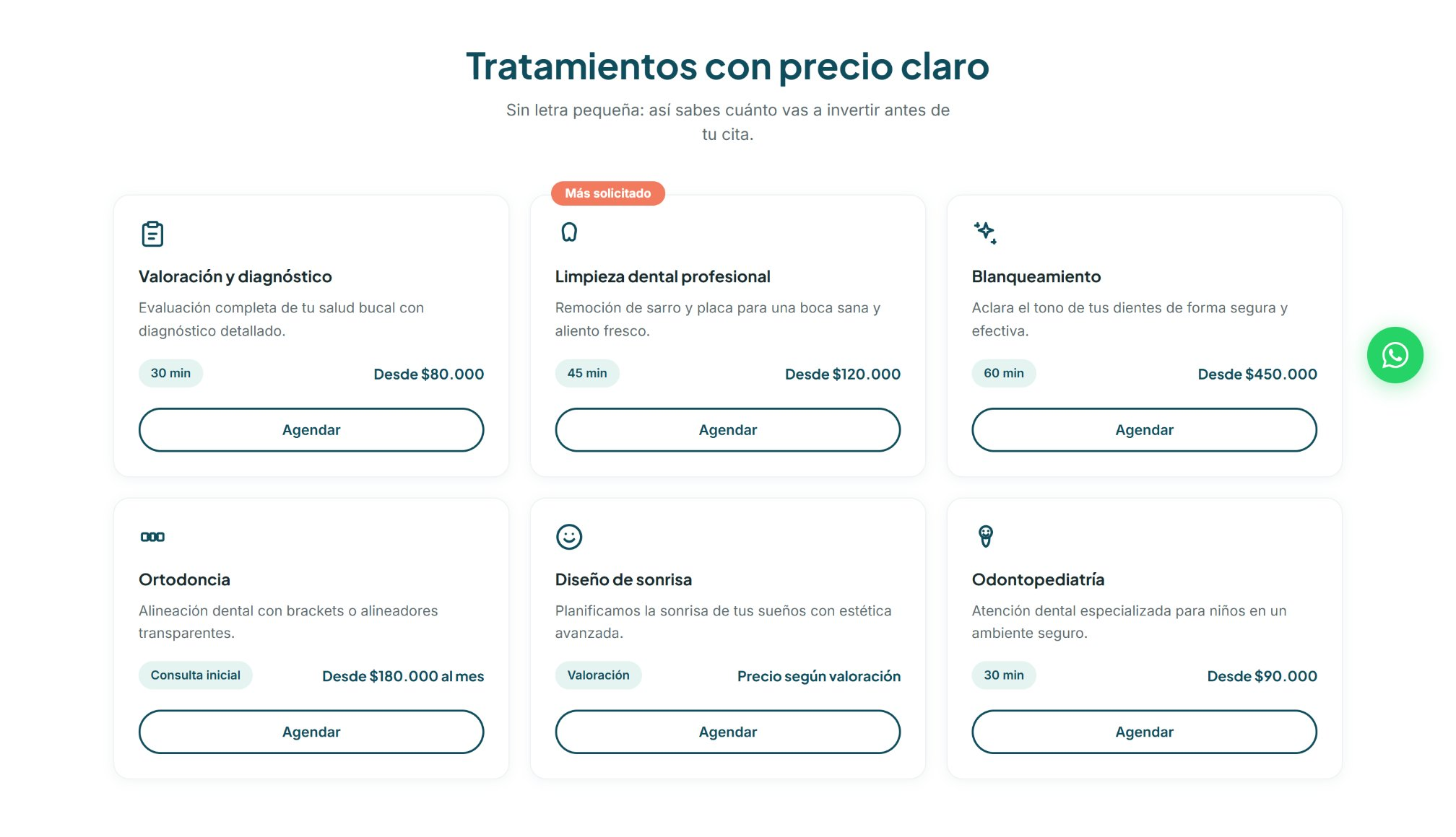
Look for the price of your most common treatment on your site. If it isn’t there without contacting the practice, don’t tick this.
How does 3-step booking work?
The patient picks a treatment, picks a day and confirms by message. The form asks for only four details: name, phone, treatment and preferred day. Everything else, like the exact time, is settled in the confirmation.
Below the button, the site says confirmation arrives during business hours. It’s a promise a real practice can keep: better something realistic than promising a reply in minutes and failing.
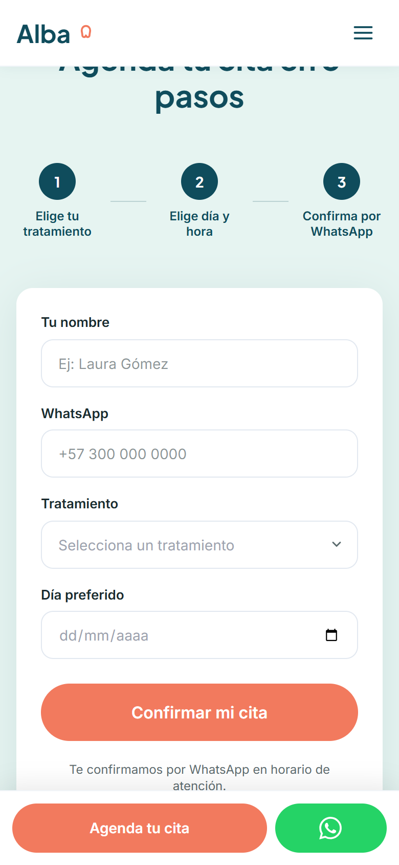
Request an appointment on your site from your phone and time yourself. If it takes over a minute or asks for more than five details, don’t tick this.
Why is the booking button always visible on mobile?
Because most patients look for a dentist on their phone, and the decision to book can come in any section: seeing a price, meeting the team or reading a review. A sticky bar at the bottom, with “Book your appointment” and a message shortcut, keeps the action one tap away.
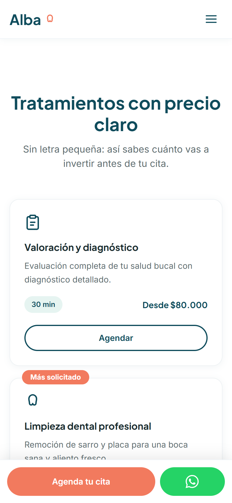
Scroll halfway down your site on your phone. If you have to go back to the top to book, don’t tick this.
What trust signals does a dental practice website need?
It needs to show who will treat the patient: name, photo, specialty and years of experience of each dentist, real photos of the office and reviews from other patients. In healthcare, trust weighs more than in almost any other industry.
Since Alba is fictional, its team and reviews are too. For a real practice, these signals only work if they’re authentic: a made-up testimonial or a stock photo passed off as the team is easy to spot and destroys trust.
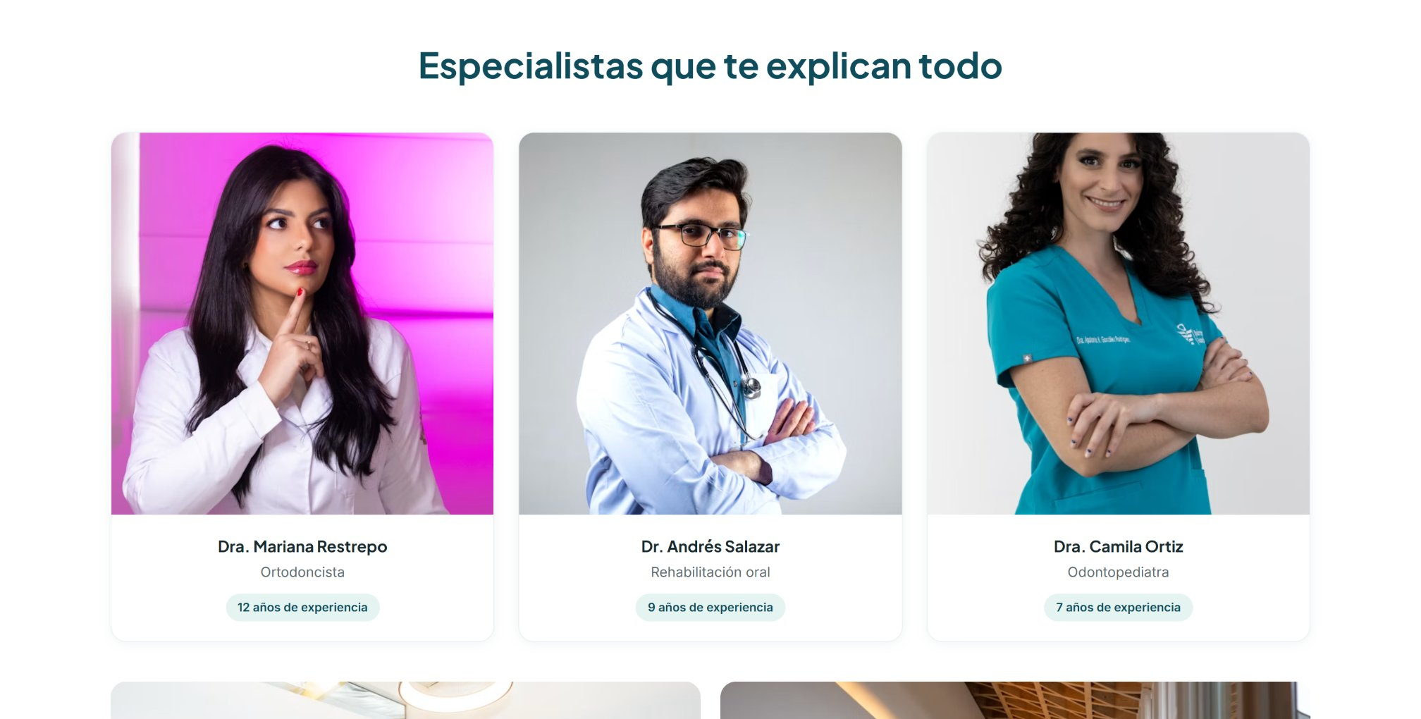
Check whether your site shows your dentists with name, photo and specialty. If not, don’t tick this.
How do you measure whether a dental website works?
By the appointments it generates, not the visits. Since Alba is a concept case, it has no real results, but these are the metrics we would set up from day one: how many people submit the booking form, how many tap to call or message and which treatments get the most booking clicks.
In Google Analytics 4 you do it with events like generate_lead for booking requests and a custom event for call and message clicks.
Ask yourself how many appointments came from your website last month. If you don’t know, don’t tick this.
What can your dental practice apply today?
Even without a redesign, you can start with what you didn’t tick. If you ticked along the way, this is your result:
Your site informs, but it doesn’t book. Start with prices and booking.
Key pieces are missing. Fix first the ones that save messages.
Your site already works for you. Next step: measure and improve with data.
Every decision behind Alba starts from one simple question: does this save the patient a message or bring them closer to booking? A dental website doesn’t have to be a digital business card: it can answer the usual questions, show prices honestly, build trust and book appointments while the team treats patients.
To see what else a website needs to convert, read the 7 elements of a website that converts and website UX design vs. aesthetics.
Check how your website performs today
The free website audit shows your site’s speed, SEO and accessibility with Google data. If you’d rather talk about a website that books appointments, message us.
Frequently asked questions
It’s a project we design for a fictional brand to show our process and design decisions. It isn’t a real client and it doesn’t present real results.
A headline that says what the patient gets, “from” prices for the most common treatments, booking from a phone in under a minute, the team with names and specialties, and tracking for the appointments that come in.
In most cases, yes. A “from” price on the most common treatments answers the patient’s first question, and when a price depends on an assessment, saying so clearly is enough.
Yes. A short form that sends the details to the team and a confirmation by message are enough to start. Later you can connect a calendar or a booking system.
The name, photo, specialty and experience of each dentist, real photos of the office and authentic patient reviews.